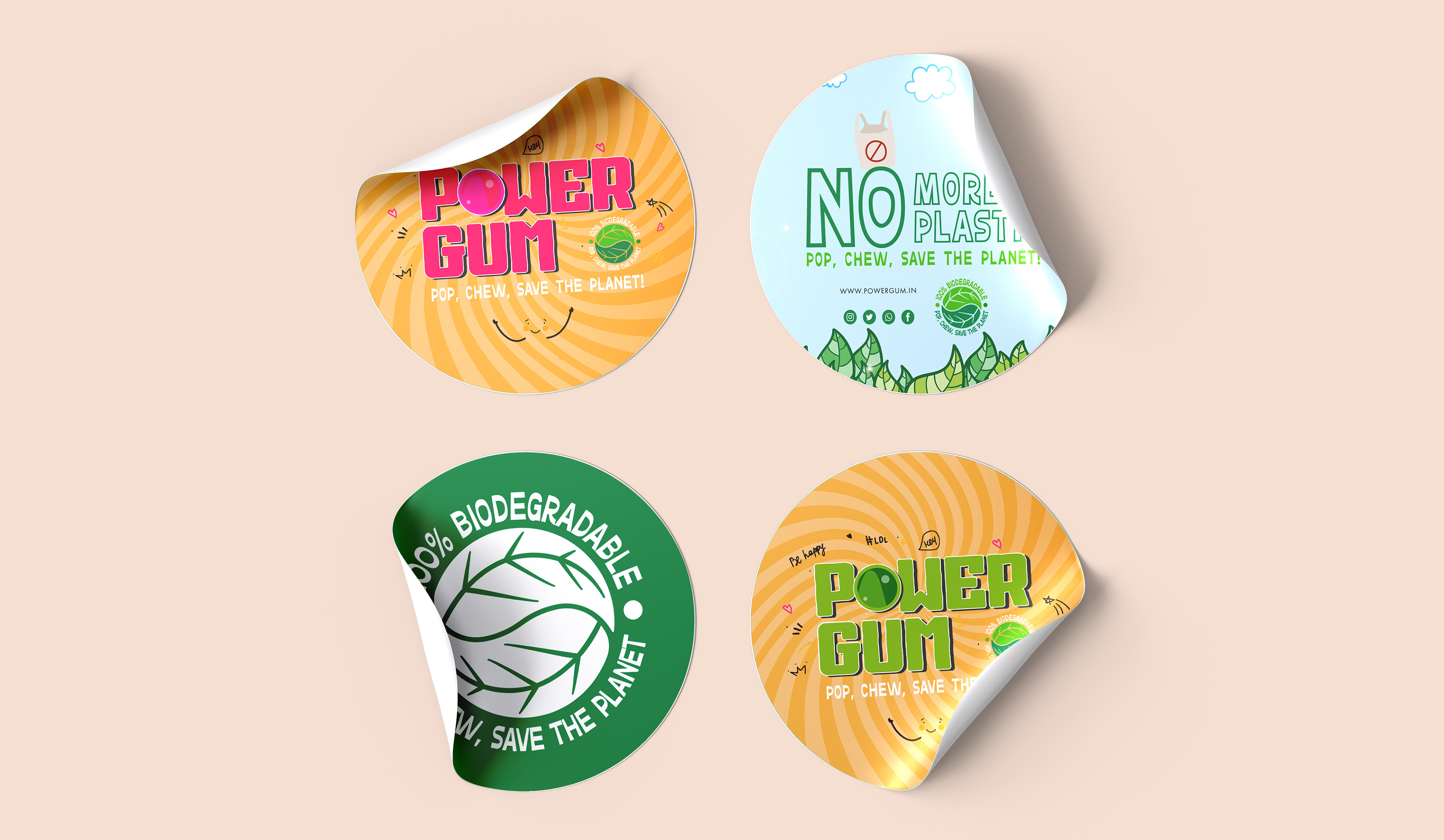
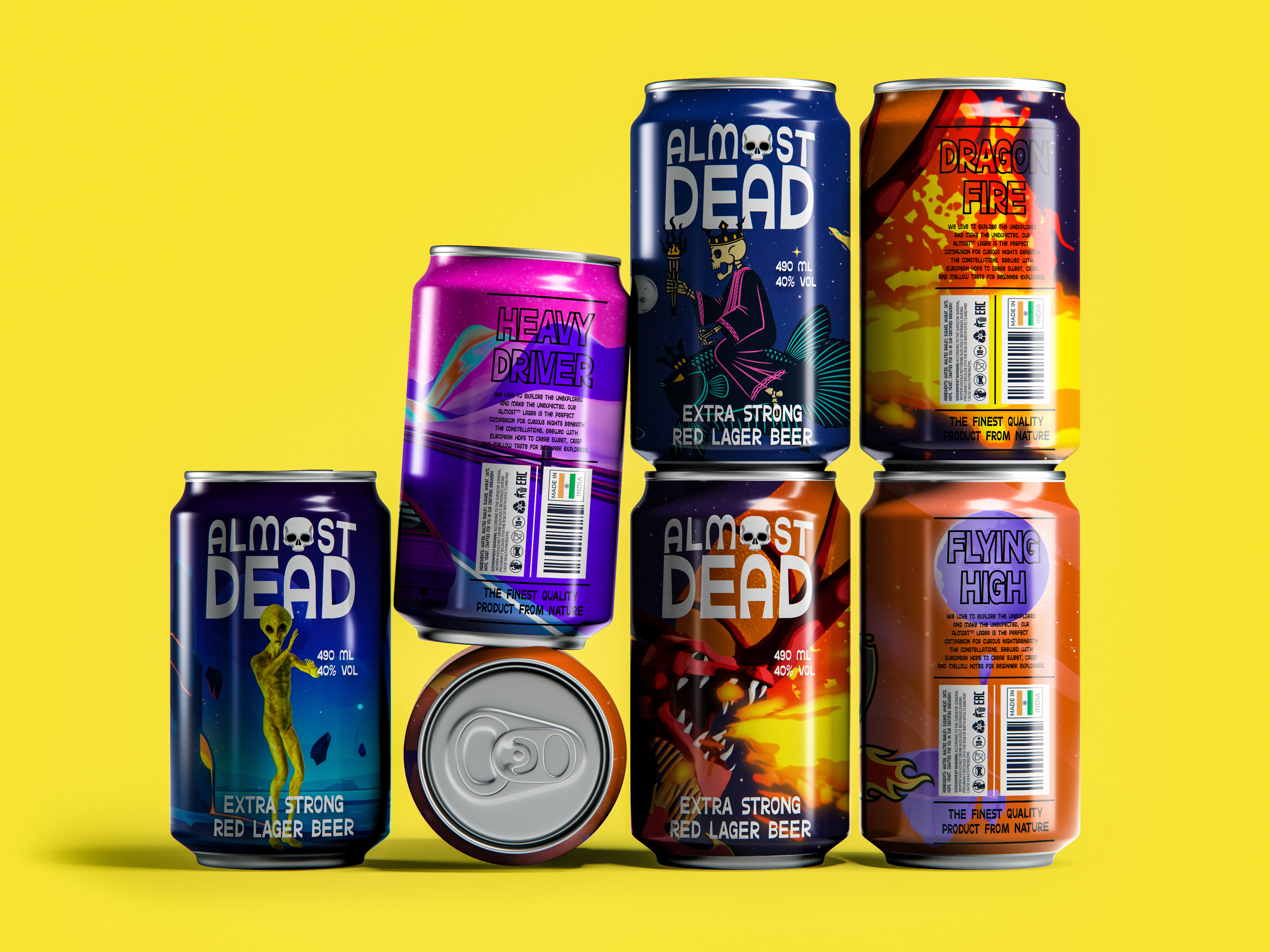
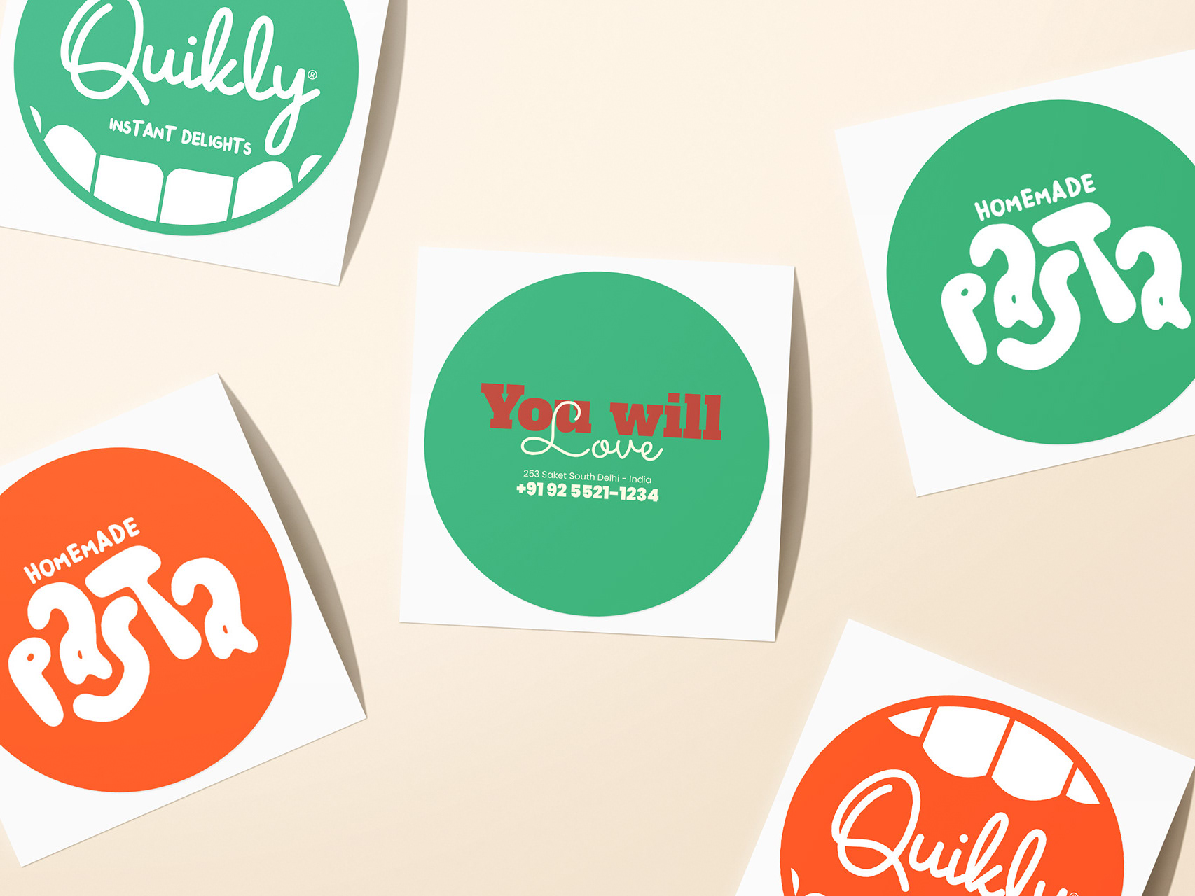
Creating PowerGum™'s visual identity, a brand dedicated to guilt-free and eco-friendly chewing, poses exciting challenges. Here's a quick rundown:
1. Sustainability Message:
Challenge: Communicate PowerGum's commitment to a plastic-free Earth.
Solution: Use visuals like recycling symbols, nature-inspired graphics, and eco-friendly color palettes to convey environmental values.
2. Flavor Representation:
Challenge: Showcase PowerGum™'s vibrant flavors visually.
Solution: Create lively graphics, bold colors, and flavor-specific elements to capture the essence of each variant.
3. Playful Atmosphere:
Challenge: Portray playfulness aligned with positive environmental impact.
Solution: Infuse playful typography, engaging illustrations, and smile-inducing visuals for a fun and positive brand image.
4. Consistency Across Platforms:
Challenge: Maintain a consistent visual identity.
Solution: Develop a style guide for uniform colors, typography, and graphics across packaging, social media, and advertising.
5. Sustainable Packaging:
Challenge: Design packaging aligning with eco-friendly values.
Solution: Utilize biodegradable or recyclable materials and incorporate visuals emphasizing sustainability.
In short, PowerGum™'s visual identity, with sustainable elements, vibrant flavors, playfulness, and consistency, embodies the brand's essence. Let's share feedback, appreciation, and spread the power of creativity. Together, we'll make chewing guilt-free, environmentally friendly, and downright fabulous. Chew on, friends, and let the magic unfold!
